Our Services
What can Ciniva do for your company?
Learn About Services
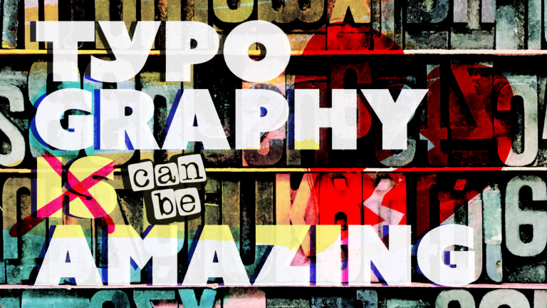
More than just a graphical element, typography has the power to evoke emotion, create atmosphere, and even empower messaging. When used correctly, typography becomes design itself – working together with art and imagery to tell a story, saying so much more than the words themselves.Admittedly, we could spend the day jabbering about type. Its ability to add personality and voice, rules and considerations, how it defines design, and so on. But we thought we’d start by exploring the most common categories – Serif and Sans Serif.
And while there are endless sub-categories that fall into each group – diving into the most recognizable styles provide a better understanding behind the foundation of typography.
The Serif category (technically known as the Roman category), refers to the flat, sloping slabs at the feet and ends of letters.
Think Times New Roman. These serifs were a result of calligraphy pens and the way a scribe would turn the flat edge of this tool to end a letter. It became an art form and scribes became masters in the beautification of each and every character.
That style carried over into today, but there really is no mechanical reason for it in the modern age. Typefaces are designed digitally (for the most part), and the addition of a serif is merely an ode to that historic style. The voice of the serif typeface is a direct reflection of its origin and time.
A serif typeface speaks in a refined, dignified tone. It proclaims experience, taste, and sometimes elegance. We see serifs in newspapers, fashion magazines, haberdasheries, luxury car brands, banks, whiskey brands, etc.
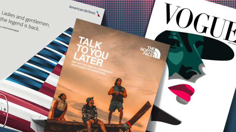
It’s a way to dress your message in a $3,000 suit with cufflinks made of solid gold. It can also speak with the dusty wisdom of a village cobbler. The Bodoni typeface family is a great example of elegance and experience. Vogue magazine has a Bodoni inspired typeface for their brand.
Sans Serif (technically known as Gothic), is the exact opposite in look and voice. Sans Serif refers to the absence of serifs. Flat, basic, lines and shapes that easily and efficiently convey a message.
Sans Serif was super popular for sign making. The large, fat lettering could be seen from far away and is easy to decipher. It then became popular in the Bauhaus movement of minimalist design. Removing decorative assets and flare and leaving only the necessary components of design was the basic principle of this movement.
Helvetica was born from this movement. Some would argue that it is the most popular typeface family in the world. The North Face, American Airlines and about a hundred other brands use it for their identity.
The voice of Sans Serif is that of the common people. It gets out of its own way and lets the heart of a message breakthrough without too much influence. It’s bold and declarative but can also be subtle and unassuming.The Sans Serif category is one that relies heavily on its font family or weight to tell its story. A bold sans serif would invite you over to the grand opening of a store with huge discounts. A condensed, light Sans Serif would tell you the name of a small coffee shop on the corner. You’ll find all manner of sans serif used in advertising and headlines. It’s probably the most commonly used category of typeface today.
Want to talk typography? We are here for you. Let’s chat.