Transforming the website of a national construction leader
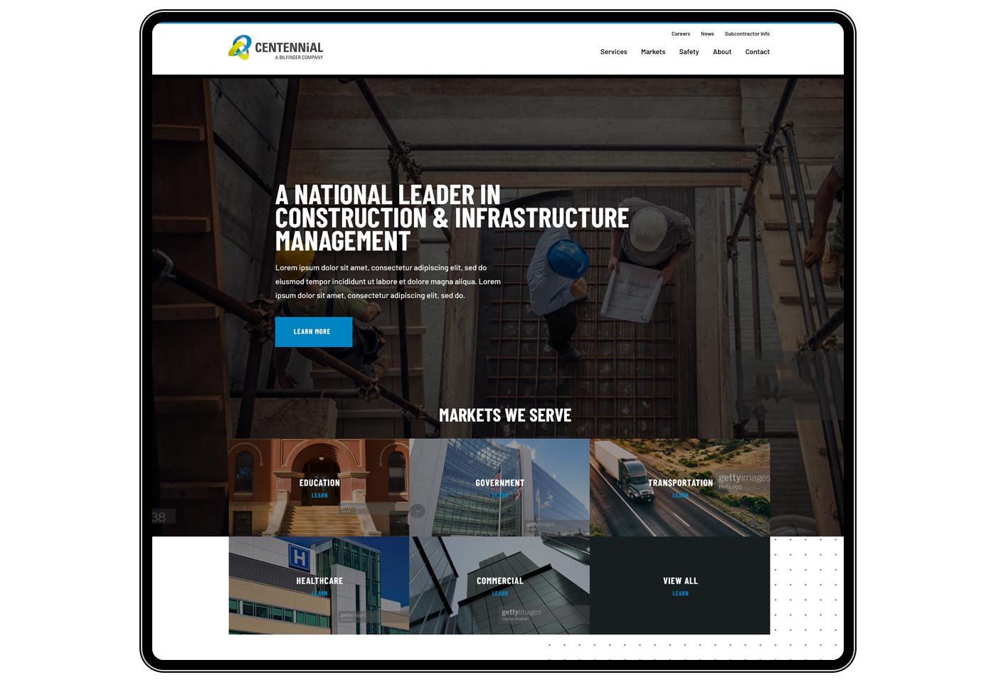
When Centennial Contractors approached Ciniva to assist with designing and developing a new website, they had an old static website that was not performing for them. They sought a visually appealing website that featured projects, resources for employees, and information for potential clients.
Once the Ciniva team gathered all of the requirements and information needed, we got to work on designing a clean, user-focused website that had targeted calls-to-action. With the addition of featured projects, we set up the new site as an ideal business development tool. In addition to our web work, we also established and set up a Google Analytics account for them and added search engine optimization.
Selecting the right strategy is a crucial step, as it will influence decisions moving forward
Getting the project on the right track
We spent the first few meetings brainstorming the best way to pivot Centennial's website with new visuals. We thought it would be best to present a few options to aid Centennial's leadership in selecting strong typography that best reflected their brand. Other branding elements such as logos and color schemes were incorporated into style mockups. Clear font choices and a blue and punchy green color scheme allowed us to begin work on design concepts.
Setting the stage for presentation
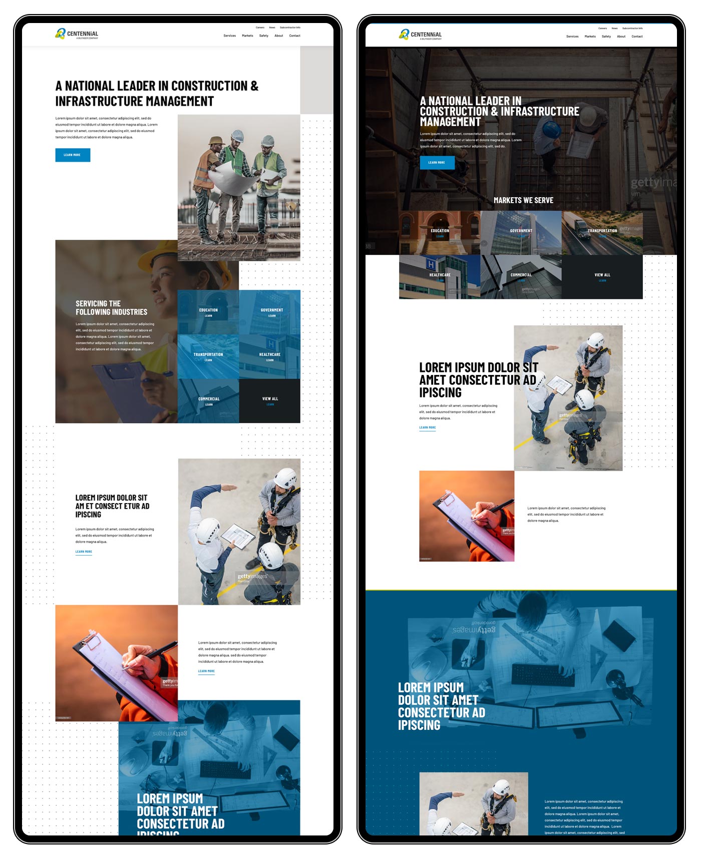
We also presented multiple directions for the site design. We knew we wanted to play off the concept of "constructed," using large rectangular areas to call attention to different kinds of content as well as alternating between light and colorful images to encourage viewers to flow down the page. Our first style had a unique hand-built feel to it, but due to the anticipated site audience we ultimately went with a more accessible style.
Focusing content for a number of audiences
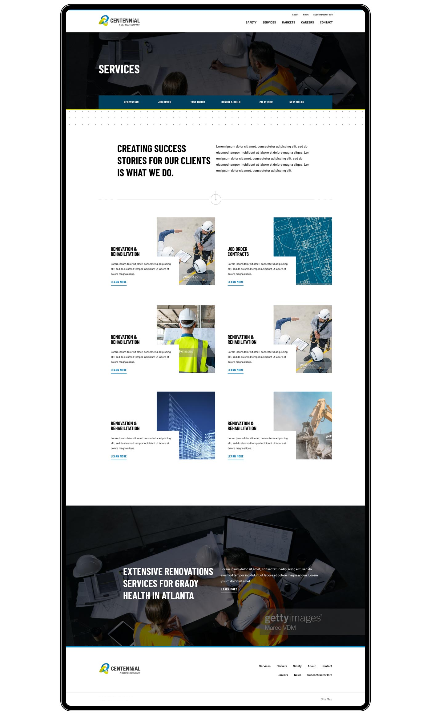
Centennial provides a wide number of services to clients in many industries. Strategies for this type of business are usually split between two options: Either use general language and a small number of pages, or use highly targeted language on a larger number of pages. In this case we went with the latter option. Allowing Centennial to speak to each individual audience was an important part of the site. We then built upon this by allowing search engine optimization to dedicate keywords to each individual page.
A flexible framework for content
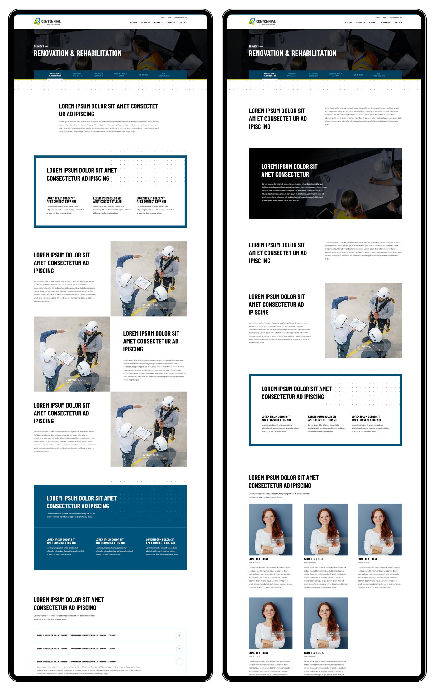
Instead of spending hundreds of hours designing dozens of different pages, we needed a way to keep costs manageable. We built a single page template that included many different ways to display content. This allowed the Centennial team to produce specific site content that targeted specific design elements on each page. This flexible design system gave Centennial the time needed to tune content while the Ciniva team built the remainder of the site.
Supplementing the site with fresh content
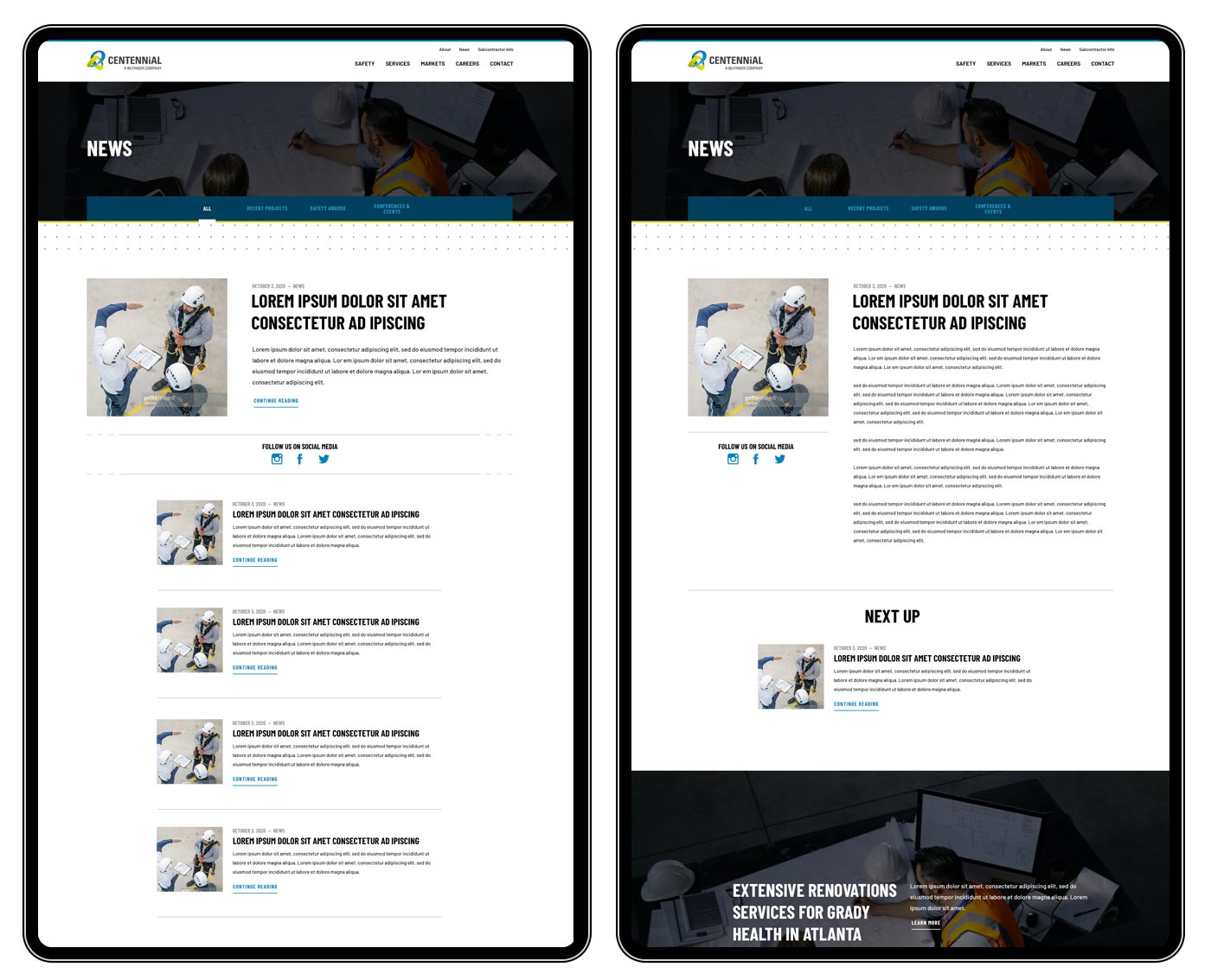
Since Centennial has robust but static content on most pages, it was important to have a section of the site that could be frequently updated. A News section allows them to post fresh content regarding new contracts, project successes, and case studies as needed.
Delivering a seemless experience for all viewers
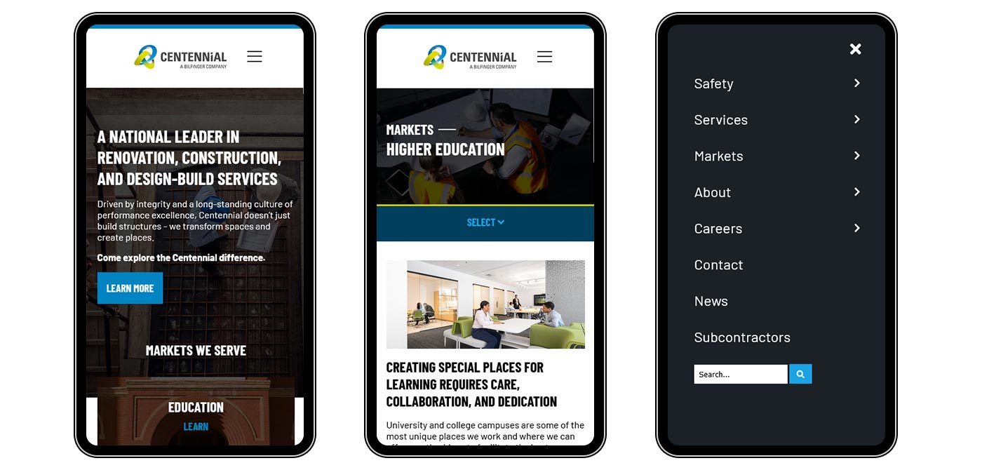
All of Ciniva's site are fully mobile-responsive, and this one is no exception. Current employees and workers on a job site need the ability to quickly locate manuals and forms from their mobile devices. At the same time, potential clients and project managers are more likely to be in an office setting with a full desktop browser. Centennial's site works for all audiences.
